A Price Action Tell: Support at Prior Resistance, Resistance at Prior Support

As we talked about in our introduction to price action, markets are cyclical creatures. Prices go up, prices go down and as traders, the most we can hope to do is ride on the right side of the wave for a bit.
But along the way there’s a number of deductions that traders can make that can allow for strategy to enter the picture, and in terms of trend, support and resistance is fairly important. Bullish trends will often price-in a series of higher-highs and higher-lows while bearish trends will show the opposite. But – markets aren’t always trending, as we’ll often see ranges or digestion pop-up when prices are fairly equalized. That’s what brings on inside bars and we’ll talk about those a little later in this sub-module.
PRICE ACTION SUPPORT AND RESISTANCE
As discussed throughout our education section, there’s a plethora of ways to find support and resistance levels. Fibonacci is a popular tool and psychological levels can carry some significant weight. But, if markets don’t acknowledge that support or resistance – what is its point? There isn’t one, right? The only utility for support and resistance is the ability to highlight something that may happen, while allowing the trader to adopt an objective framework for their own activity within a market.
As we looked at in our Price Action Support and Resistance article, there’s a couple of primary ways to use prior price action to find actionable levels to work with. But we also ended by saying that there’s one more way that traders can incorporate prior price movements in the effort of finding support and resistance, and that’s by incorporating older levels that may come back into the picture.
Support and Old or Prior Resistance
When in an up-trend, prices will often ebb and flow with a general bias towards the ebbing as opposed to the flowing. And when prices do pullback, traders are often looking for that point with which it becomes attractive again to buy. One possible reference point – prior swing-highs or prior points of resistance. And, in the case of down-trends, prior swing-lows or points of support as potential resistance. Let’s look at an example in GBP/USD to illustrate.
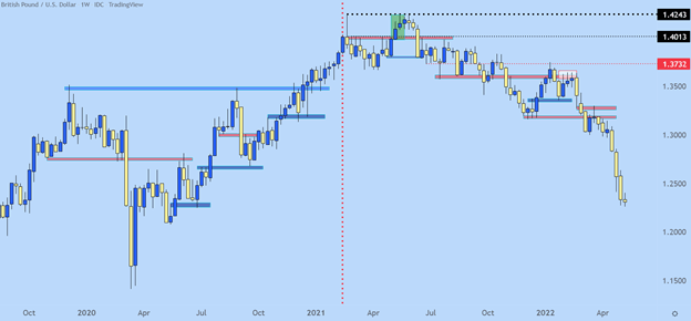
Each of the blue lines below indicate an area of prior resistance that came into play as support. And red lines indicate an area of support that’s come into the picture as resistance.
Chart prepared by James Stanley; GBP/USD Weekly chart, Oct 2019 – April 2022
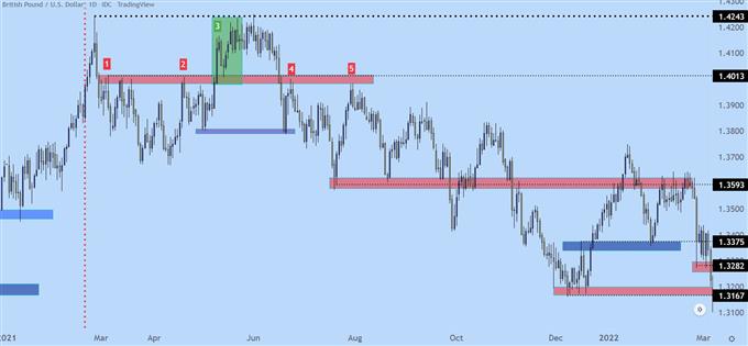
Let’s get a bit more granular with this situation, using the below chart. We’ll begin with the red vertical line, after which price action puts in a swing at the 1.4013 level (marked as ‘1’ on the below chart). You can see multiple wicks on the daily chart in the red box accompanying that line, and this is highlighting a resistance reaction that holds from early-March through the May open (marked as ‘2). That resistance offered a few different inflections but buyers eventually break through, indicated by the green box in early-May (marked as ‘3’).
But, buyers are thwarted at the same exact level that had come into play a few months earlier, plotted at 1.4243, and after bulls failed to breakthrough, sellers eventually take control and elicit a breakdown back-below the 1.4013 price. Buyers push down to the purple box, around 1.3800, before a bounce develops and that sends prices right back into that same zone of resistance (marked as ‘4’).
That inflection leads to another fresh low, around the 1.3600 area, but sellers still don’t have full control, as price pushes back up to that same resistance zone but fails to get all the way there. This is a lower-high, and indication that sellers were on the sidelines and unwilling to wait for price to test the high. They enter a bit earlier, and this leads to a lower high before sellers swing a bit more aggressively (marked as ‘5’).
GBP/USD Daily Price Chart (2021 – Feb 2022)

Chart prepared by James Stanley; GBP/USD Daily chart, Jan 2021 – March 2022
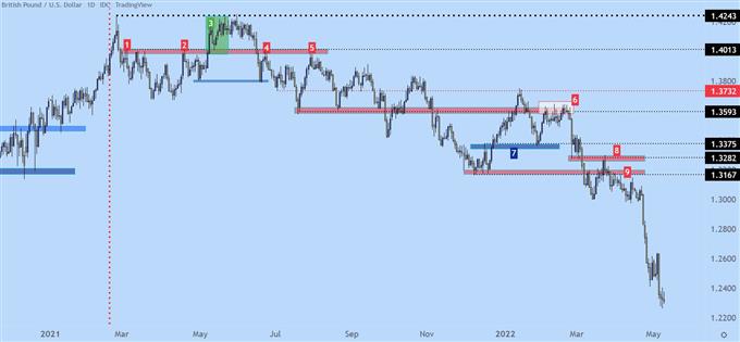
After that second resistance reaction (marked by ‘5’ above), sellers push price right back to support, which isn’t ready to give way yet. That happens a couple of months later.
But, perhaps more importantly, in early 2022 trade, that same zone around the 1.3600 handle becomes a massive spot of resistance. This gyration has now taken six months but there’s still a discernible bearish bias as indicated by the lower-highs. But, notably, notice how intense the resistance reaction is in the white box on the right side of the chart (marked as ‘6’). This took almost three weeks to resolve but, once it did, prices started a sell-off that ran for a long time. Along the way there were more items of short-term resistance coming in as support (marked as ‘7’) and prior items of support coming in as resistance (marked as ‘8’). In box 9, I wanted to highlight the build of lower-highs, below box 8 as that prior swing was continuing to help form some resistance.
GBP/USD Daily Price Chart (2021 – May 2022)

Chart prepared by James Stanley; GBP/USD Daily chart, Jan 2021 – May 2022
--- Written by James Stanley, Senior Strategist for DailyFX.com


.jpg.27c55ea07d5a17683fbdbda06b8fcace.jpg)
0 Comments
Recommended Comments
There are no comments to display.
Create an account or sign in to comment
You need to be a member in order to leave a comment
Create an account
Sign up for a new account in our community. It's easy!
Register a new accountSign in
Already have an account? Sign in here.
Sign In Now